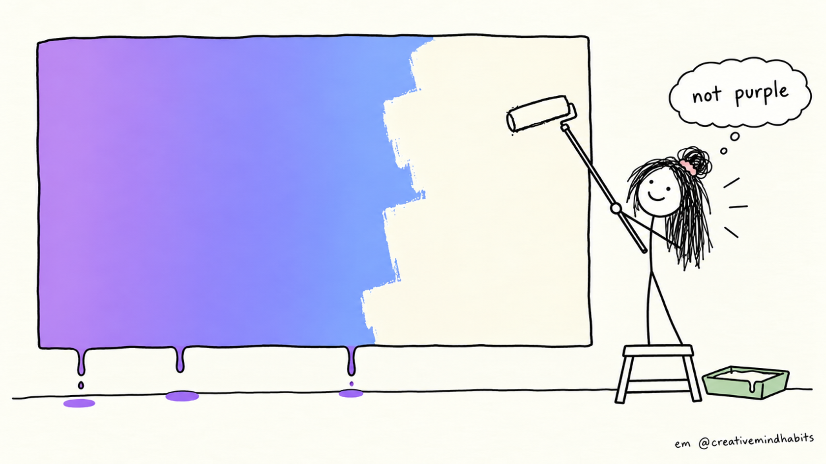
Make it look real, part 1. This is the deep dive on item 1 of the full checklist. If you only want the fix, the box above has a prompt to paste into your AI coding tool.
You built the app, it works, and the top of the page is a big purple-to-blue gradient. It's the first thing a visitor sees, and it's also the thing most likely to make them think "AI made this" before they've read a word.
This post covers why it keeps showing up, what to put there instead, and how to check that it's gone.
Why it reads as AI-made
A gradient isn't wrong. The problem is that it's the same gradient everywhere. AI tools reach for the same indigo-to-violet-to-blue palette over and over, so thousands of unrelated apps wear identical colours.
The commonly reported cause is Tailwind's own history: Tailwind's creator, Adam Wathan, posted in August 2025 that he regretted making bg-indigo-500 the default button colour in Tailwind UI years earlier, and the idea is that models learned from all the code that copied it (summary on DEV). That's an explanation from commentary, not a measured study, so treat it as plausible rather than proven. What you can check yourself is simpler: search your own code for indigo, violet and purple. If you didn't choose them, an AI did.
Two things make it worse:
- It sits on the biggest area of the page. A default in a tiny icon goes unnoticed. A default behind your headline is the whole first impression.
- It tells people nothing about you. A brand colour should say something about what the product is. A generic gradient says nothing.
What to use instead
The fix is smaller than it sounds. You need three things:
- A flat background. Plain white, off-white or one very light tint.
- One brand colour, used for buttons, links and one or two highlights.
- A dark text colour that reads clearly on the background.
That's it. One accent on a calm background looks more expensive than two loud colours fading into each other.
Our two examples
Creative Mind Habits. The homepage hero is a flat off-white (#FBFAF3) with near-black text. The only decoration is a yellow highlighter swipe under a few words. Funnily enough, the swipe is a CSS linear-gradient with hard stops, which shows the point: the problem isn't the property, it's a blurry two-colour wash across the whole hero.
NudgeCue. Its landing page hero uses a soft tint at the top: the brand purple at 8% opacity fading to nothing, in one hue. In Tailwind that's bg-gradient-to-b from-primary/[0.08] via-amber-50/40 to-transparent. It reads as a faint wash, not a statement. We still use it, so I'm not going to tell you gradients are banned. The rule I use is: one hue, very low contrast, and never strong enough to compete with the headline. If you can notice the gradient at a glance, it's too strong.
Step by step
1. Find every gradient
Run this in your project folder:
grep -rnE "gradient|from-|via-|to-(indigo|violet|purple|blue)" src --include=*.css --include=*.tsx --include=*.jsx --include=*.html --include=*.vue
Write down which matches are on big areas (hero, page background, large cards) and which are small (one button). Big areas are the priority.
2. Choose one colour
Pick it from what the product is about, not from what looks "techy". A calm colour for a notes app, a warm one for something friendly. If you can't decide, take the colour from your logo or your main illustration.
3. Define it once
In plain CSS:
:root {
  --brand: #0f766e;        /* your one accent */
  --brand-tint: #e6f2f0;   /* very light version, for backgrounds */
  --page: #fbfaf3;         /* page background */
  --ink: #1a1a1a;          /* text */
}
In Tailwind v4, put the same values in your theme so classes like bg-brand work:
@theme {
  --color-brand: #0f766e;
  --color-brand-tint: #e6f2f0;
  --color-page: #fbfaf3;
  --color-ink: #1a1a1a;
}
Defining it once matters. If the colour is hard-coded in forty places, the next AI edit will happily add a forty-first, in indigo.
4. Swap the hero
Before:
<section class="bg-gradient-to-br from-indigo-500 via-purple-500 to-blue-500 text-white">
After:
<section class="bg-page text-ink">
  <!-- headline in text-ink, one button in bg-brand text-white -->
</section>
If a plain background feels empty, use bg-brand-tint for the hero and keep the rest of the page bg-page. Don't add the gradient back to fill the gap. Add a real screenshot or a hand-made illustration instead.
5. Check contrast
Text on the new colours has to be readable. The accessibility guideline (WCAG 2.2, contrast minimum) asks for at least 4.5:1 for normal text and 3:1 for large text. Paste your two colours into any contrast checker. White text on a light brand colour is the usual failure, so if it fails, darken the colour or switch to dark text.
6. Look at dark mode and phones
A flat background can behave differently in dark mode. Check that --page and --ink have dark versions, and open the page at phone width.
How to check you're done
- The
grepfrom step 1 shows no gradient on any large area. - Searching for
indigo,violetandpurplefinds only colours you chose. - Squint at the page. If your eye lands on the headline first, not on the background, it's working.
- Show it to one person for five seconds and ask what the product is. Colour should help them, not distract.
Part 2 will cover the next item on the list: emoji used as icons. For the whole checklist, including a fix prompt for every point, use the signup on the main post. If you're starting from scratch, the vibe coding starter pack is free.