Make it look real, part 2. This is the deep dive on item 2 of the full checklist. Part 1 was how to remove the purple gradient hero. If you only want the fix, the box above has a prompt to paste into your AI coding tool.
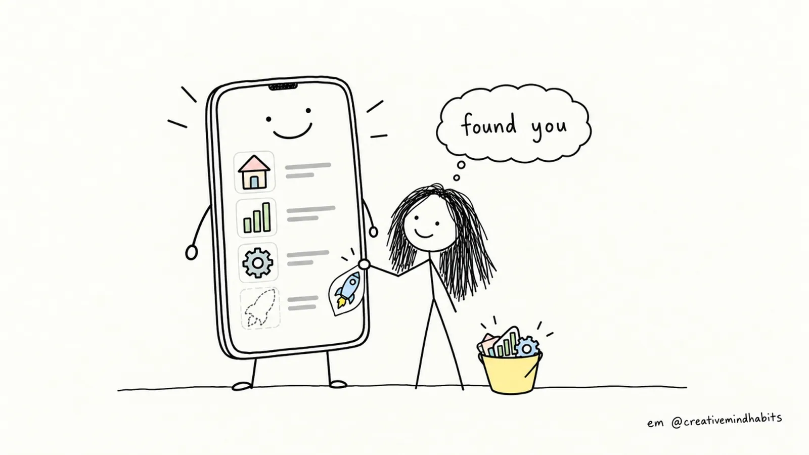
Open a vibe-coded app and look at the navigation. There's a good chance it reads: 🏠 Home, 📊 Dashboard, ⚙️ Settings, 🚀 Upgrade. It works, and it also looks like thousands of other apps.
This post explains why emoji used as icons give an app away, how to find every one, and how to swap them for a proper icon set without breaking anything.
Why it reads as AI-made
Emoji are the easiest "icon" an AI tool can produce. They need no install, no import and no sizing, so they get typed straight into the interface. Design write-ups on spotting vibe-coded interfaces list them again and again, next to the purple gradient (one example). Those are blog posts and opinion, not a study, but the problems below you can check yourself:
- They look different on every device. The same 🚀 is drawn by Apple, Google, Microsoft or Samsung, each in its own style. You can't control which one your visitor sees.
- They can't be styled. You can't match them to your brand colour or give them a consistent line weight. A flat outline icon sits next to a glossy cartoon, and the page looks assembled from parts.
- They don't scale or align well. Emoji sit on the text line differently from icons, and can look blurry when enlarged.
- They say "placeholder". A real product picked its icons on purpose. An emoji reads as "nobody decided".
What to use instead
One icon set, used everywhere, at a small number of fixed sizes. Common free choices are Lucide, Heroicons and Phosphor. Which one matters less than using only one.
A caveat: reports say AI coding tools often default to Lucide (SaaStr), so Lucide icons can themselves become a tell if they're used for everything, in the default size and stroke. The set is only half of it. The other half is choosing the weight, the size and where you use icons at all.
A real example from NudgeCue
NudgeCue, my free classroom app, went through this twice.
1. The interface icons. The app has its own icon file, src/components/icons.tsx. Every icon is imported from one place, wrapped so it has the same default size (24 px) and a set weight (bold for arrows and ticks, duotone for most others). Components never import from the library directly. That means that when I (or an AI tool) need an arrow, there is one obvious place to get it, and the style can't drift. We wrote that into the project's CLAUDE.md as a rule on October 30: use the app's own icon set, not emoji or other icon packs. On November 10 a review pass still found text arrows and one emoji in a signup email. Those were swapped for icons from the same file. Rules in the context file help, but you still have to search for the leftovers.
2. The tier badges. Teachers pick a symbol for each points level, and they were stored as emoji. On November 4 I replaced them: they render differently on every device and blur on a classroom projector. The 21 symbols a teacher can choose now draw as 128 px WebP images from the MIT-licensed Fluent Emoji 3D set, 84 KB in total. Anything outside those 21 falls back to the emoji. Not every emoji needs to become a line icon. The point was to pick one consistent style on purpose.
Step by step
1. Find every emoji
Emoji don't match a simple word search, so use a character-range search. This works in most terminals with GNU grep and PCRE support:
grep -rnP "[\x{1F300}-\x{1FAFF}\x{2600}-\x{27BF}]" src --include=*.tsx --include=*.jsx --include=*.html --include=*.vue --include=*.css
Write down where they are. Sort them into: navigation, buttons, headings, empty states, badges. Leave alone anything a user types (names, notes, reactions). That's their content, not your interface.
2. Choose one set, one style
Pick a library, then decide: outline or filled, and which sizes. For example 16 px inside text, 20 px in buttons and nav, 24 px for empty states. Write the rule down so it survives the next AI edit.
3. Make one place to import from
// src/components/icons.tsx
export { Home, BarChart3, Settings, Plus, Trash2 } from 'lucide-react';
Components then use import { Home } from '@/components/icons'. If you ever change library, you edit one file. Add the rule to your project's CLAUDE.md or similar context file: "Icons come only from src/components/icons.tsx. No emoji as icons."
4. Swap them
Before:
<a href="/dashboard">📊 Dashboard</a>
After:
<a href="/dashboard" className="flex items-center gap-2">
  <BarChart3 size={20} aria-hidden="true" />
  Dashboard
</a>
Icon-only buttons need a name, because a screen reader has nothing to read:
<button aria-label="Delete class" title="Delete class">
  <Trash2 size={20} aria-hidden="true" />
</button>
If no icon fits an item, drop the decoration. A plain text label is better than a forced icon.
5. Watch for emoji in data
If your database stores emoji (like NudgeCue's tier symbols), don't edit the rows. Map the stored value to an icon in code, with a fallback to the original for anything you don't recognise. That's what keeps old data working.
How to check you're done
- The search from step 1 only finds emoji that users typed.
- Every icon is the same style and one of your set sizes.
- Icons stay aligned and readable at phone width and in dark mode.
- You can tab to every icon-only button and hear a name for it with a screen reader.
Part 3 will cover the next item on the list: stop centring everything. For the whole checklist with a fix prompt for every point, use the signup on the main post. If you're starting from scratch, the vibe coding starter pack is free.